To display a full-screen dialog when a button is tapped, follow these steps:
Trigger the Dialog: on Button’s onPressed option, use the showDialog function to display the dialog.
class _MyHomePageState extends State<MyHomePage> {
 @override
 Widget build(BuildContext context) {
   return Scaffold(
     body: Center(
       child: ElevatedButton(
         onPressed: () {
           showDialog(
             context: context,
             builder: (BuildContext context) {
               return const Dialog();
             },
           );
         },
         child: const Text('Click'),
       ),
     ),
   );
 }
}
Create the Dialog Content: Wrap your new screen or widget with an AlertDialog. This will serve as the content for your full-screen dialog.
class Dialog extends StatelessWidget {
 const Dialog({super.key});
 @override
 Widget build(BuildContext context) {
   return BackdropFilter(
     filter: ImageFilter.blur(sigmaX: 2, sigmaY: 2),
     child: AlertDialog(
       shape: const RoundedRectangleBorder(borderRadius: BorderRadius.zero),
       backgroundColor: Colors.transparent,
       surfaceTintColor: Colors.black,
       insetPadding: EdgeInsets.zero,
       title: Align(
         alignment: Alignment.topRight,
         child: GestureDetector(
           child: const Icon(
             Icons.cancel_outlined,
             color: Colors.white,
           ),
           onTap: () {
             Navigator.of(context).pop();
           },
         ),
       ),
       content: SizedBox(
         width: MediaQuery.of(context).size.width,
         child: const Column(
           mainAxisAlignment: MainAxisAlignment.center,
           crossAxisAlignment: CrossAxisAlignment.center,
           children: [
             SizedBox(height: 12),
             Text(
               'Hello Flutter',
               style: TextStyle(
                 fontSize: 20,
                 color: Colors.white,
                 fontWeight: FontWeight.w600,
               ),
               textAlign: TextAlign.center,
             ),
           ],
         ),
       ),
     ),
   );
 }
}
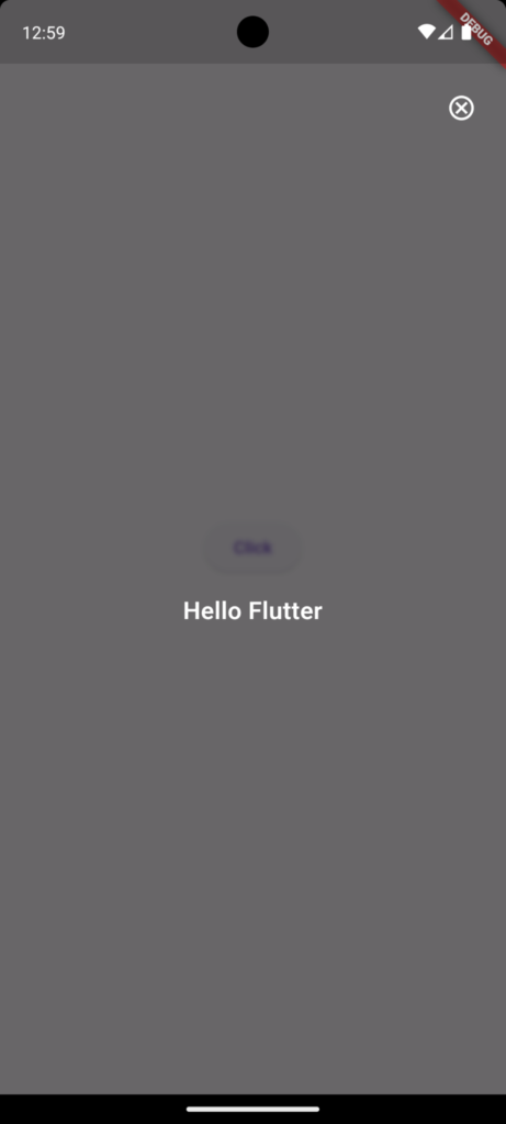
After completing the above steps, Dialog Screen will look like this.
Support On Demand!