Understanding Flexbox Layout in React Native
Last Updated on June 3, 2024
Table of Contents
If you have worked with mobile applications development or frontend development, you might be familiar with designing an application using flexbox. If you don’t know, then don’t worry. Just stick to this tutorial till the end; you will come to know the basics and implementation of flexbox layout.
Let’s move ahead with our tutorial: Flexbox Layout in React Native Application without further ado.
The first thing to know is what our tutorial has for you. So, these are the main sections that we will cover in this blog post.
So much knowledge, right? Moving towards our first section. Let’s read about what flexbox is and learn about its concept.
Flexible Box Module, popularly known as flexbox, is a designing model that deals with a one-dimensional layout of an application. Now, what does this one-dimensional layout means? Simple, it states that the concept of flexbox relies on the layout with one dimension at a time – it could be a row or column.
Further, flexbox gives the freedom to distribute the space between interface items and powerful alignments capabilities. Flexbox layout has made developers’ lives easy by lessening application responsiveness struggles.
Fundamental concepts of Flexbox Layout
Flexbox deals with two axes –
Before, CSS had given more importance to left-to-write writing mode and made it default. But, with modern layout methods, a wide range of writing modes was introduced. Thus, it stopped the assumption of text lines starting at the top left of the document and ending at the right of the document.
The area of the document on which we want to apply the flex property can be said as a flex container. To create a flex container, you just need to set the display property(of the area’s container) as flex or inline-flex. And, items within the area’s container will become flex items.
Looking for React Native developers to build high-performance mobile applications?
Bacancy has the most dedicated and skilled developers. Contact us today and hire React Native developer!
React Native provides limited but sufficient flexbox layout properties and values. The main difference is that all the React Native container elements are, by default, Flex containers. There’s no need to add a display: ‘flex’. It avoids writing extra code.
Keep in mind that the child element of the parent container can be positioned with the property Flex item – ‘align-self’. Here’s an example of applying the property align-self:flex-end to Flex container (last box) that contains child elements.

Here are different defaults for React native development that makes flexbox more advantageous.

This section will discuss flexbox properties that can enhance your application’s design.

Let’s implement flexbox in our React Native application.
Our demo application will have a parent container with three boxes:
The parent and child container is a View Component.
// Layout
const App = () => {
 return (
   <View style={styles.container}>
     <View style={styles.orangeBox} />
     <View style={styles.whiteBox} />
     <View style={styles.greenBox} />
   </View>
 );
};
// Style
const styles = StyleSheet.create({
 container: {
   backgroundColor: '#454545',
 },
 orangeBox: {
   width: 80,
   height: 80,
   backgroundColor: 'orange',
 },
 whiteBox: {
   width: 80,
   height: 80,
   backgroundColor: 'white',
 },
 greenBox: {
   width: 80,
   height: 80,
   backgroundColor: 'blue',
 },
});
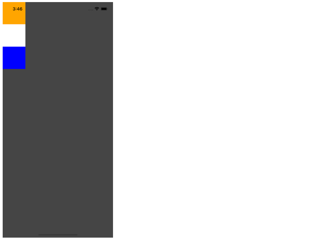
Output

After adding the property is flex: 1, the space is split into a single group; thus, our parent container will display on the entire screen.
container: {
   flex: 1,
   backgroundColor: '#454545',
 },
Output

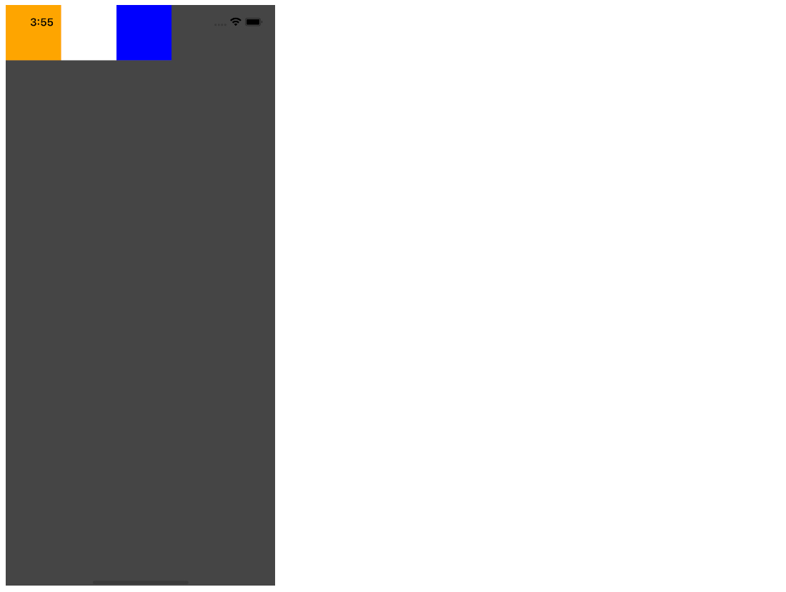
flexDirection controls the direction of child elements of the parent container. Here are the values you can add to flexDirection.
container: {
   flex: 1,
   flexDirection: 'row',
   backgroundColor: '#454545',
 },
Output

justifyContent is used to align the child elements within the main axis of the parent container. You can set the elements horizontally and vertically by setting flexDirection as row and column.
The property offers a few more values are stated below:
You MIght Like to Read: The Ultimate Guide to Optimize React Native App Performance
Let’s see a few examples.
justifyContent: ‘flex-start’
container: {
   flex: 1,
   flexDirection: 'row',
   justifyContent: 'flex-start',
   backgroundColor: '#454545',
 },
Output

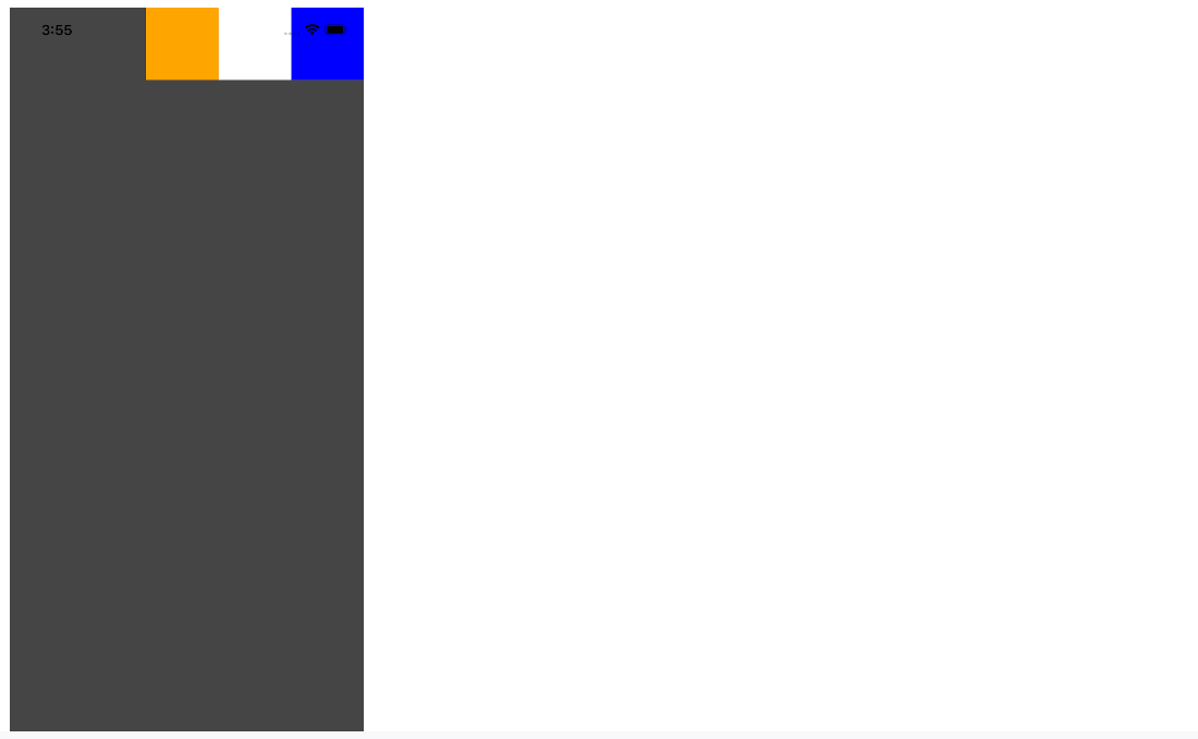
Below are the screenshots of the output of each of these values used for property justifyContent.
justifyContent: ‘flex-end’

justifyContent: ‘center’

justifyContent: ‘space-around’

justifyContent: ‘space-between’

justifyContent: ‘space-evenly’

alignItems is used to align the child with the cross axis of its parent container. Similar to justifyContent that aligns with the main axis, this property will align the children with the cross axis.
Let’s take some examples.
alignItems: ‘flex-start’
container: {
   flex: 1,
   flexDirection: 'row',
   justifyContent: flex-start',
   alignItems: flex-start,
   backgroundColor: '#454545',
 },
Output

Below are the screenshots of each of these values.
alignItems: ‘flex-end’

alignItems: ‘center’

So, this was understanding and implementing the Flexbox layout in React Native. I hope the purpose of the tutorial was served as you expected.
If you wish to clone the repository and play around with the code. Here’s the github repo: flexbox-layout-demo.
If you want to practice more with an online game interface, then you can play the game flexbox froggy.
Flexbox is easy to maintain and understand; once you have understood its concept, you would love to work with it. If you have any queries, suggestions, or feedback, write us back. Also, feel free to suggest topics if you want us to write a tutorial on them. Keep learning!
Your Success Is Guaranteed !
We accelerate the release of digital product and guaranteed their success
We Use Slack, Jira & GitHub for Accurate Deployment and Effective Communication.