Any of the web users who access your website has a specific goal. There is one common thing between the user and their goal is a form. Forms are one of the significant types of interactions for the users on the web as well as in the applications. I am writing this blog post to get you through the practical principles that have been drafted from field testing, eye tracking, usability testing and actual complaints made by different users. Let’s dig in.
1. Structure of Form
The form displays with a respective title for each section of the form and it asks for only those fields that are required from the user side. Every additional field of the form will affect its transformation rate. Order of the field should arrange logically as per the user perspective, not as per the application or database logic. Sometimes address fields are displayed before the name field.
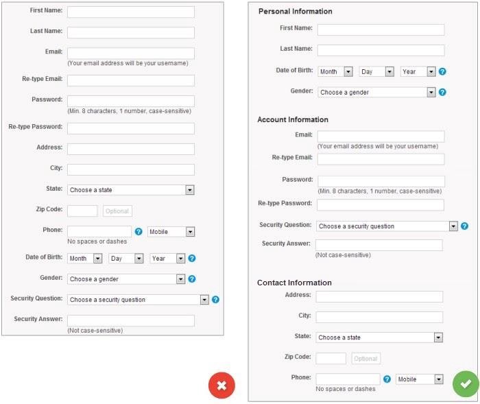
Image credits: NNGroup
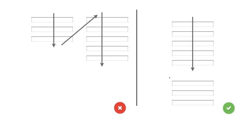
One of the most common problems in form is it is implemented with multiple columns and form fields, where there are chances that the user conversation with the application will break. If the form has horizontally adjacent fields, for referring all fields of the form then the user should in Z patterns, slowing the speed of understanding and obscure the clear path to completion.
2. Input Fields
For input fields, I have covered a few following areas:
Mandatory Fields and Optional Fields:
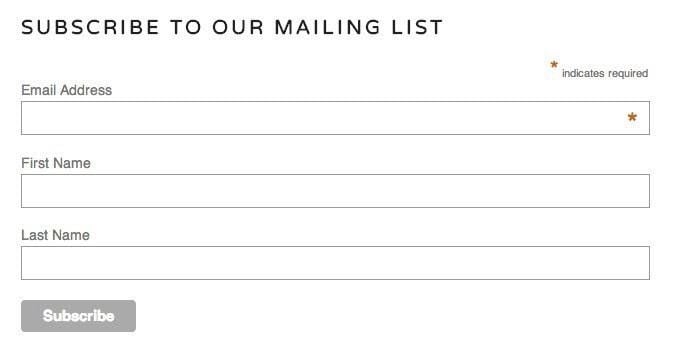
The developer should at least clearly discriminate which input fields are mandatory and which fields are optional. It is advisable to represent it in an asterisk (*) for mandatory fields. The developer should avoid option fields in the form.
Number of Fields:
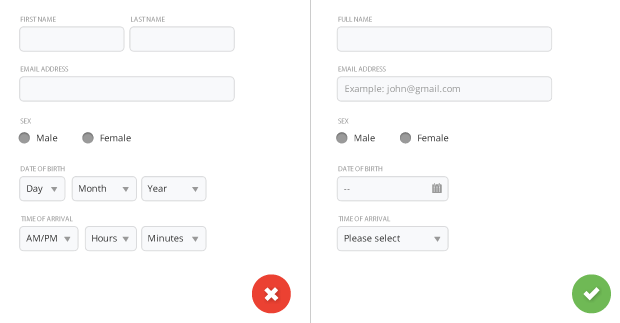
The more number of fields are the more it irritates the user. It also reduces the form loading time. Below is an example of combining multiple fields in one field.
Indexing on the fields: Make Form Keyboard-friendly
The user should also be able to use applications with the keyboard. For that indexing should set on each and every component of the form. So the user can perform the action using the keyboard only. You can find detailed requirements for keyboard interaction patterns in W3C’s Authoring Practices for Design Patterns.
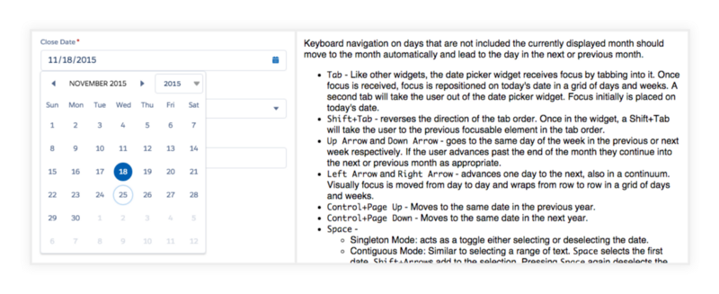
Date picker should be relevant to the W3C guidelines
Input Field Autofocus:
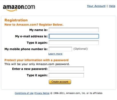
Specifies that the input field should be in focus immediately when the cursor in the field. Refer below image as an example of the Amazon registration form that has both autofocus and indication.

For Mobile: The Keyboard as per the Required Text Inputs
The keyboard should display as per the text input. I.e. In the numeric field, the numeric keyboard should display and for the text field, the qwerty keyboard should display.
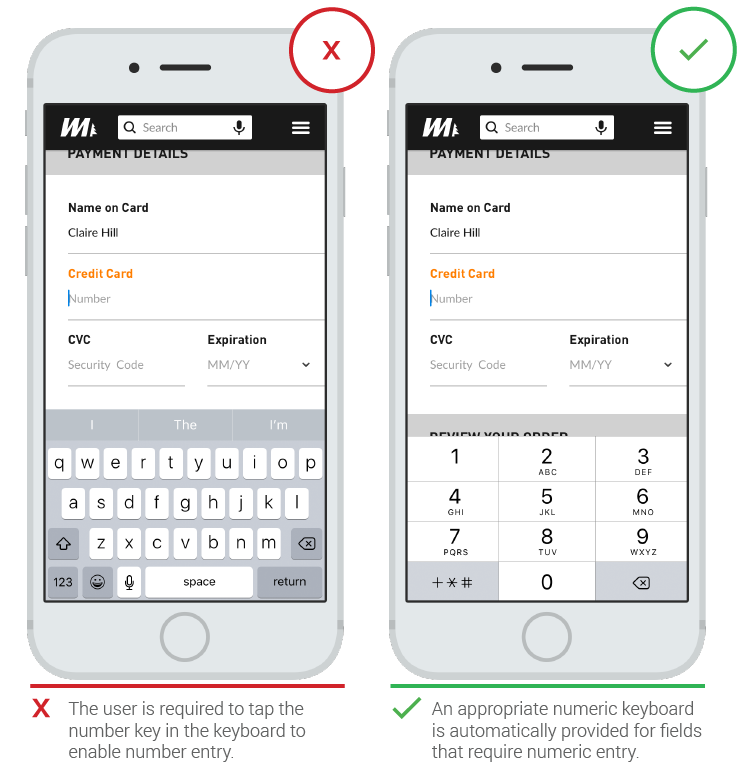
Image Reference: Google
3. Labels
A field label is a descriptive text you create that appears with or covers the field on the form and helps the user understand the field.
Use Sentence-Style Capitalization:
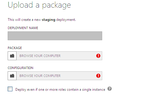
The capitalization characters are very attractive in any form and human eyes are attracted to the field easily. But need to remember one thing — never use all capital letters in the form. Below mentioned the example of the “All Capital ” text.
Form Label Proximity: Left Alignment vs Right Alignment vs Top Alignment
The left alignment of the fields creates a large blank space between the field’s label and field. This creates more distraction for users while reviewing the form.
The left alignment of the fields is easier from a user’s perspective to view all fields of the form because there is a less blank space between the field’s label and fields.
The top alignment of the fields and labels are displayed inside the field are ideal for forms. It’s easy to view the field name as it’s displayed around the fields.
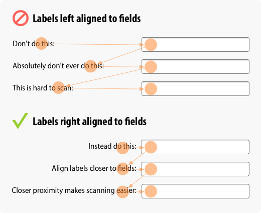
Image Reference: UX movement
Number of Words:
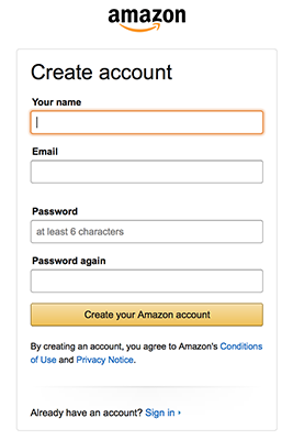
The words of the form should be shorter and descriptive, so end users can easily view the form. Below mentioned the example of the old and new version of the amazon registration form.
Inline Labels (Placeholder Text):
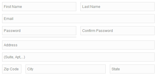
Putting labels inside text boxes have significant advantages as it helps to reduce the length as well as the width of your forms.
4. Action Buttons
Primary Button vs Secondary Button:
When a user performs any action, that time they’ll see at least two buttons. One is the primary button and the other is the secondary button. As per the user perspective, the Primary button is displayed with more highlighted or dark color and the secondary button is displayed lighter in color. Below I have mentioned the example for the same.
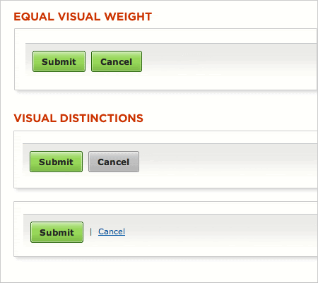
Image Reference: Lukew
Button Location:
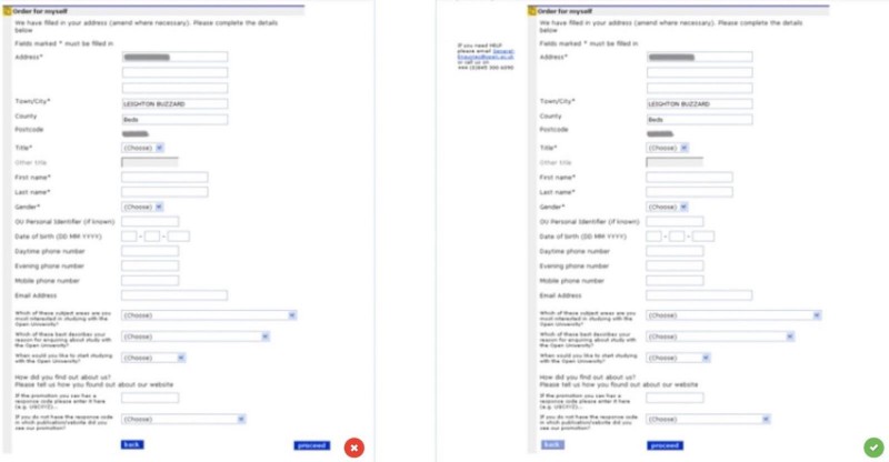
On multi-page forms, you’ll have more than one button back button as well as a continue button. ‘Back’ button to take the user to the previous page and ‘continue’ button to take the user to the next page. It is ideal to keep the continue button on the right on the other hand Back button on the left.
Naming Conventions:
We need to circumvent common words such as “Submit”, “Save”, “Reset” and so on for any particular action. Instead of that user’s respective naming for the button such as “Create Account”, ”Subscribe Now”, ”Send Message” and so on.
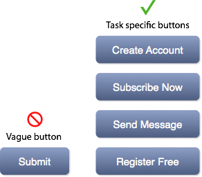
Image Reference: UX movement
Wrapping Up
The well-designed interface and enjoyable user-experience is a key to increase your user interaction and drive sales. Every form is a conversation with your users. Our UI/UX designers can collaborate with you to create user-centered forms, objectives, and goals to help you accomplish the whole process with perfection. Leverage our UI/UX design and development services to build visually compelling, highly intuitive and optimal designs with the end-user in mind to captivate your audience and convert them into potential customers.

